The Great White North
Koodo Mobile (Canada) is a smaller MNO (Mobile Network Operator) - akin to Cricket Mobile here in the US - that is part of Telus Mobile. They have an arguably… interesting branding palette, but the design team (which I was at the helm of) were more than ready for the challenge.
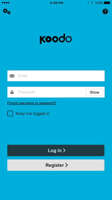
During this project, I remotely worked with, and directly communicated with, the technical project manager from Koodo to align product with technical/business requirements and objectives. Implemented visual design guidelines (colors, iconography, etc…) within product/platform framework to give Koodo their branding voice, look and feel, to the MobileAware product.
One of the major challenges in communicating mobile user experience principals and strategies to the Koodo team was that they were very hung-up on replicating the web experience in a native mobile application. I lead the design team into two lengthy discussions with their technical project manager and a designer from Koodo on these differences, and what we could effectively do to "bridge the gap" - while maintaining the integrity of the MobileAware product. Along with screen-share video conference calls, running them as walkthroughs of the "look and feel" of the app, I put together a comparison document - a powerpoint presentation analyzing and illustrating just how closely the MobileAware product matched the functions and objectives of the Koodo website (and proposed secondary mobile solution). This powerpoint was then presented by the MoblieAware project and executive team to Koodo to continue the dialog and momentum of the project before the new year.

